100vwで今の画面の横幅いっぱいのサイズを指定できて、10文字で横幅いっぱいにしたければ、font-size: 10vwを指定すれば大丈夫。
ただこれだと、「画面幅」に対して計算されるので、divの中のdivとか、「レイアウトの中で」横幅いっぱいにしたい場合にvwを指定するのは計算が大変。
JavaScriptで汎用的に文字サイズを可変にできるようにした。
サンプル
<!DOCTYPE html>
<html lang="ja">
<head>
  <meta charset="UTF-8">
  <meta name="viewport" content="width=device-width, initial-scale=1.0">
  <title>Document</title>
  <style>
    /* A Modern CSS Reset */
    *,*::before,*::after{box-sizing:border-box}body,h1,h2,h3,h4,p,figure,blockquote,dl,dd{margin:0}ul[role="list"],ol[role="list"]{list-style:none}html:focus-within{scroll-behavior:smooth}body{min-height:100vh;text-rendering:optimizeSpeed;line-height:1.5}a:not([class]){text-decoration-skip-ink:auto}img,picture{max-width:100%;display:block}input,button,textarea,select{font:inherit}@media(prefers-reduced-motion:reduce){html:focus-within{scroll-behavior:auto}*,*::before,*::after{animation-duration:.01ms !important;animation-iteration-count:1 !important;transition-duration:.01ms !important;scroll-behavior:auto !important}}

    .wrapper {
      width: 100%;
      max-width: 1000px;
      margin: 0 auto;
      background-color: #ccc;
      padding: 20px;
    }
    .two-column {
      display: flex;
    }
    .two-column p {
      width: 50%;
    }

  </style>
</head>
<body>
  <div class="wrapper">
    <p class="js-resize-text">文字サイズが、幅いっぱいで可変に</p>
    <p class="js-resize-text">あああああああああああああああああああああああああ</p>
    <div class="two-column">
      <p class="js-resize-text">文字サイズが、幅いっぱいで可変に</p>
      <p class="js-resize-text">文字サイズが、幅いっぱいで可変になります</p>
    </div>
  </div>

  <script>
    function resize() {
      var resizeText = document.getElementsByClassName('js-resize-text');
      for (let i = 0; i < resizeText.length; i++) {
        var body = document.getElementsByTagName('body')[0];
        var wrapper = resizeText[i].clientWidth / body.clientWidth;
        var fontSizeVw = wrapper / resizeText[i].innerHTML.length;
        // ▼ letter-spacingを0.1emに指定していた場合、1.1をかける
        // var fontSizeVw = wrapper / (resizeText[i].innerHTML.length; * 1.1);
        resizeText[i].style.fontSize = fontSizeVw * 100 + 'vw' ;
      }
    }
    // 初期
    window.onload = function(){
      resize();
    }
    // リサイズした時
    window.onresize = function(){
      resize();
    }
  </script>
</body>
</html>
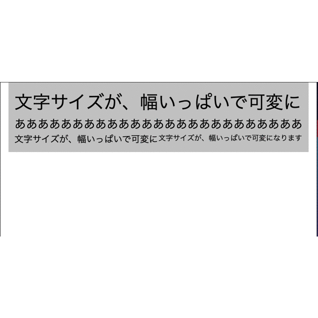
こんな感じになる
JQuery使う場合
  <script src="https://code.jquery.com/jquery-3.4.1.min.js"></script>
  <script>
    function resize() {
      var $resizeText = $('.js-resize-text');
      $resizeText.each(function() {
        var wrapper = $(this).width() / $('body').width();
        var fontSizeVw = wrapper / $(this).text().length;
        // ▼ letter-spacingを0.1emに指定していた場合、1.1をかける
        // var fontSizeVw = wrapper / ($(this).text().length * 1.1);
        $(this).css('font-size', fontSizeVw * 100 + 'vw');
      });
    }
    // 初期
    window.onload = function(){
      resize();
    }
    // リサイズした時
    window.onresize = function(){
      resize();
    }
  </script>